How to Create, Edit, & Style Columns in Elementor

Columns can be manipulated and styled either via the options in the Elementor Panel on the left or by right-clicking the Column handle and choosing from the context menu that pops up. 

Right-Click Options

If you wish to add a new column or duplicate a column, right-click a column handle and choose either Add New Column or Duplicate from the context menu. You can also copy and paste a column into another section using Copy and Paste options here, or you can copy and paste only the style (without the content) from one column to another. Clicking Navigator here will open the Navigator already set to that particular column. And of course, clicking Delete here will delete the column.

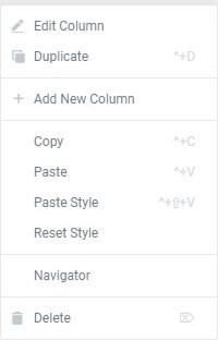
If you click Edit Column, the column’s options will be displayed in the Elementor Panel to the left with all of the following options available to you.

Layout

  1. Column Width (%): Set your Columns Width
  2. Vertical Align: Set your Column Content’s vertical alignment. This way, you will be able to stick the content of all the columns of a section to the bottom, the middle of the top, or “stretch to fill” to align columns with unequal heights. Choose from Top, Middle, Bottom, Space Between, Space Around, Space Evenly
  3. Horizontal Align: This extends the ability of the inline positioning and lets you horizontally align the inline widgets that are placed in the same row. Choose from Start, Center, End, Space Between, Space Around, Space Evenly
  4. HTML Tag: Set an HTML Tag for your column. Learn more about HTML Tags

Space Definitions

  • Space Between – Widgets start and end at the edge of the column, with equal space between them
  • Space Around – Widgets are spaced equally, and the edges are half the size of the space between widgets
  • Space Evenly – Widgets have equal space between, before and after them

Style

Background

Background Type: Choose between Classic (which allows you to set a background color or image), Gradient (allowing you to set a color gradient background), or an image Slideshow background.


Background Overlay (available if a Background Type is chosen)

  1. Background Type: Choose between Classic or Gradient
  2. Blend Mode: Set a Blend Mode
  3. CSS Filters: Add Blur, Brightness, Contrast, and Saturation

Border

  1. Border Type: Set a Border Type
  2. Border Radius: Set your Border Radius
  3. Box Shadow: Add a Box Shadow

Typography

Set Typography Colors for the section

Note: The ‘Set Typography’ colors won’t work if Default Colors are enabled.


Advanced

Advanced

  1. Margin: Set the section Margin
  2. Padding: Set the section Padding
  3. Z-index: Set the Z-Index. Learn more about Z-Index
  4. Entrance Animation: Click the dropdown to choose an animation. Learn more about Entrance Animation
  5. CSS ID: Set a CSS ID for your column
  6. CSS Classes: Set CSS Classes for your column
  7. Responsive: Show or Hide column on Desktop, Tablet, or Mobile